Anyways, since moving to San Fran I've seen my fair share of hipster tattoos, and have noticed a few trends despite all the diversity. One such trend is particularly intriguing: hipsters seem to love both a) ultra-detailed, super-saturated, photo-realistic tattoos, and b) on the extreme other end of the aesthetic spectrum, simple, plain, unembellished linework tattoos. You won't typically find both styles adorning the same individual, suggesting that these styles really reflect one's enduring aesthetic predilections. They damn well better - that full color rainforest sleeve is gonna be with you for a longggg time...
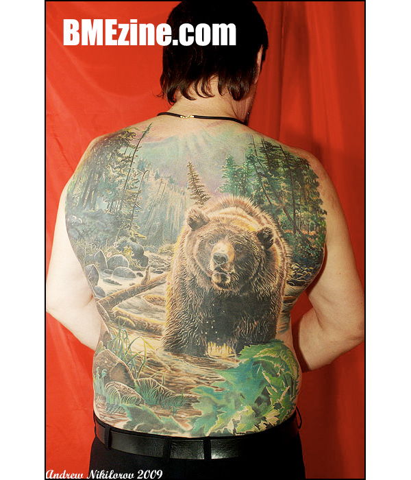
I'm personally a big fan of the more realistic breed of tattoos, as evinced by the spontaneous drooling that occurs when I visit the web galleries of such tattooists as Jesse Smith, Mike DeVries, and Jason Jacenko. But friends of mine are in love with those mysterious line tattoos...either simple geometric shapes or childlike drawings of flowers, hearts, birds....you've seen these, right? I first encountered this style of tattooing a few years ago upon visiting the webpage of Yann, a French tattooist with a truly distinctive artistic style. His tats resemble Kindergarten scribbles, but contain subtle details that unfailingly evoke a smile at the sheer silliness of it all. I can totally see the appeal of Yann's delightfully sketchy tats, but what about a tattoo like the plain square outline sported by a model in a Marc Jacobs ad (searched and searched but couldn't find an image!)? What the fuck, dude? Is it a commentary on how we've gotta start thinking outside the box about ways to fight global warming? Is it a d/l tribute to your beloved Macbook Pro? Is it just teeming with esoteric information about your inner self? Whether truly acquired for reasons existential or superficial, a tattoo like that can hold any number of meanings depending on who's asking. And surely people ask - with most tattoos one can simply infer the significance at least to some extent, but line tats beg to be inquired about.
I had always been curious about these inked anomalies, but never thought to question people with line tattoos about the significance of their designs or their affinity for a super-simple tattoo style...that is until now. Recently I spent a sunny afternoon in Dolores park unabashedly lowering my shades and inspecting every tattooed body in sight, and sure enough I found quite a few that were rendered in the style in question. As modders always are, the owners of these understated works of ink were happy to divulge some details about their affinity for simplicity.
My first interview was with a guy who goes by the name of Dante. His arms boast a total of three filled-in black rectangles, and spanning his back is a simple outline tattoo that resembles a pair of sword/wings. According to Dante, his rectangles were inspired by elemental tattoos he's seen, and represent "the void" as a simple element (however you wanna interpret that...). Now 26, he got the first of his rectangles when he was 18, acquiring the second set when he was 20. As for the locations, Dante gave an all too familiar explanation as to why he chose the spots he did for his rectangles - "Sometimes you just kinda know where you need the tattoo." He's an artist himself, and says he likes to "make art create itself," which has predisposed him to shun photo-realism in favor of abstraction. Over the course of our conversation he revealed increasingly cryptic ways of understanding his rectangle tattoos, explaining at one point with a slightly sinister growl that he sometimes sees them as "windows with only black on the other side." Dante believes that although not everyone's do, tattoos "should" have meaning to the wearer, and because of the symbolic nature of his tats that meaning doesn't have to be completely one-dimensional or remain consistent over time. Oddly enough, despite the "abstract personal significance" that Dante's tattoos have for him, one artist he approached refused to ink his second set of rectangles because he basically thought they were a waste of a tattoo. Fucking hardly - it was obvious from talking with Dante that he absolutely adores his tat, regardless of how anyone else sees or interprets them.


Next up was Peter, whose stunning red and black line tattoo caught my eye from across the park. "Damn, that looks like a Yann..." I thought to myself as I headed off in his direction, "...but it couldn't be, probably just some rip-off of his style..." But to my surprise, Peter's half sleeve was indeed inked by the fabulous Frenchy himself, and is a shining example of the incredible things dude can do with a few lines. The tattoo is Yann's interpretation of a portion of Picasso's "Guernica," and depicts a disembodied arm holding a broken sword that has a flower growing out of it. Peter explained that Picasso's original message in "Guernica" was an anti-aggression, anti-war statement that is still relevant today, and although not many people will recognize the tat as a political statement Peter is still proud to sport it.
In addition to being a reflection of Peter's political beliefs, his tat is also a reflection of his overall aesthetic affinities - "Generally I like simple aesthetics, just really minimalist-type stuff that still holds some power. I like that in all arts, music even and movies." Throughout our chat session Peter kept emphasizing that although simplicity may seem to imply a lack of depth, many works of art are strikingly powerful in their simplicity. He also mentioned, and I really appreciate his frankness in admitting this, that his attraction to simple tattoos is in part a reaction against the opposite trend in tattooing of acquiring painstakingly detailed pieces. This admission called to mind how in the 60s and 70s minimalism developed in opposition to abstract expressionism, adopting a "less is more" mentality. Peter also sports a Yann-inspired flower that was inked by a friend of his years before his genuine Yann piece, and though not so impressive as the "Guernica" tribute, is still a smile-inducing treat. Despite the fact that Yann is currently stationed in Montreal and currently has no plans of doing guest spots in the States, Peter says any future ink ventures of his will be conducted exclusively by Yann. Peter, please, for the sake of everyone with fully functioning vision, stay true to this promise and keep going back for more beautifully unique pieces of inked simplicity!

My next interview was quite impromptu, and actually occurred after I had left the park. I had stopped into a Whole Foods Market, and while getting rung up for some overpriced bread and cheese happened to notice that the cashier was sporting a very simple, black outline tattoo. In response to being asked why she chose a more basic tattoo style, she thought for a moment, then said "well, they're simple, but they're not." Simply stated, but her response conveys an oft-expressed sentiment amongst line tat canvases. Relating her love of simple tattoos with her affinity for simplicity in general, and referring specifically to children's movies, she said "It doesn't need to be this crazy CGI bullshit." She prefers 2-D comic book art, as well as the illustrations of both Tim Burton and Edward Gorey. Although relatively understated, both artists' work is quite dark and emotive despite its simplicity. She said it best..."they're simple, but they're not." Since she was working we didn't speak for long, but I really liked the way she struggled to explain her ineffable love for the unremarkably remarkable.
The next brain I picked was that of my good friend, Dor. The first words I ever spoke to him were about the line tattoos he sports on his left arm, which I obviously noticed as soon as he walked into the room. I was intrigued by the designs, and especially in my then-inebriated state couldn't help questioning him about them. One tat is a thin black line that begins just above the elbow and extends upward, culminating at his shoulderblade in a series of freehand curls meant to represent loose guitar strings and thus his love of music. The only other embellishment is a small, filled-in half circle that rests along the line at around its midpoint. The other tat begins with a tiny heart on his thumb that's connected to a single black line running the length of his forearm, accented by a treble-clef-ish swirl design just above the wrist. Dor drew both tats himself, and both were done by the same artist in his homeland of Israel. The first tattoo was originally going to be only one line, but while chatting with his tattoo artist after the line was completed both agreed that it needed a little something extra. After throwing out a few ideas they decided that the half circle and curls would work well, and went to it. Since both tats are uber-simple, I pressed Dor to try and analyze why exactly he's so attracted to minimalist tattoos. "I wanted something which is not gonna be something," Dor explained, continuing, "I don't want to be a sketchbook, I want to feel like the tattooist is putting art on me. [Tattoos] can be interesting, not just pictures of stuff you know." This got me thinking about the super-slippery meaning of the word "art." Take graffiti for example - what to one person is a breathtaking artistic wonder is to another an eyesore. Or cubism, which to some is a complex artistic style that truly engages the viewer, and to others isn't worth more than a hands-clasped-behind-your-back-pause-for-a-hot-second-then-continue treatment at the museum. For Dor, art is abstract, intangible, and plurally interpretable. It means whatever the fuck you want it to mean, as long it makes you happy when you look at it.
Contrary to Dor's conception of his tats, one park-dweller named Ben seemed to see his simple ink as not works of art but symbols. One of his tats is a dumbed-down version of the D.C. flag, another is a black linework rendition of the Hand of Fatima, a symbol used throughout history in both the Muslim and Jewish religious traditions, and the last is a set of elongated black rectangles meant to represent the twin towers, the attack upon which occurred while Ben was attending NYU. Each one represents a geographical location that holds significance for Ben, and he doesn't intend on straying from this format anytime soon. His next tattoo will be of the California coastline, minus all other details that might identify the squiggly line as a reference to his current state of residence. "I've got my style I guess," Ben said with a shrug. What's odd is that he claims to love full color sleeves on other people, but feels like he's "too boring" and "not creative enough" to come up with the concept for one of his own. Instead he acquires ink that's visually simple yet holds complex meaning.
So, I guess the main thing I've learned from talking to all these sketchbook kids is that you really can't judge a tat by its intricacy. A few black lines may indeed have more meaning and can indeed be more beautiful to some eyes than a photo-realistic tatted flower garden. You never know until you ask, and I for one am really happy I finally did. When I used to look at simple tats I would hear them scream, "Look at me, I'm different! I'm weird! I'm obscure! You totally wanna meet my owner..." - but I wasn't reading between the lines. And when it comes to simple tattoos, that's where the true message lies.


